Optimizing with Augmentation of a Virtual Store Experience
What happens when you augment and optimize Commerce, CRM and CX when every wallet share % counts?
The Ask.
Continuously optimize our site experience and CRM from user research, segmentation and engagement metrics.
The Challenge.
There are multiple verticals within the experience with overlapping customer goals and passions. Finding a good balance between product discovery and product focus required continous testing, engagment metrics and refinement. Furthermore, with client business units focused on sales KPIs, monthly and quarterly progress on funnel relationships in the metrics were required.
To further amply this challenge, the pandemic was in full swing in 2021 when I led the commerce, CRM and CX team. Greater emphasis on online sales were required as many customers could not, or were wary of retail locations.
Leadership: Samsung N.A. Verticals my team optimized with oversight
Mobile
Home Appliance
Home Electronics
Wearables
Computing
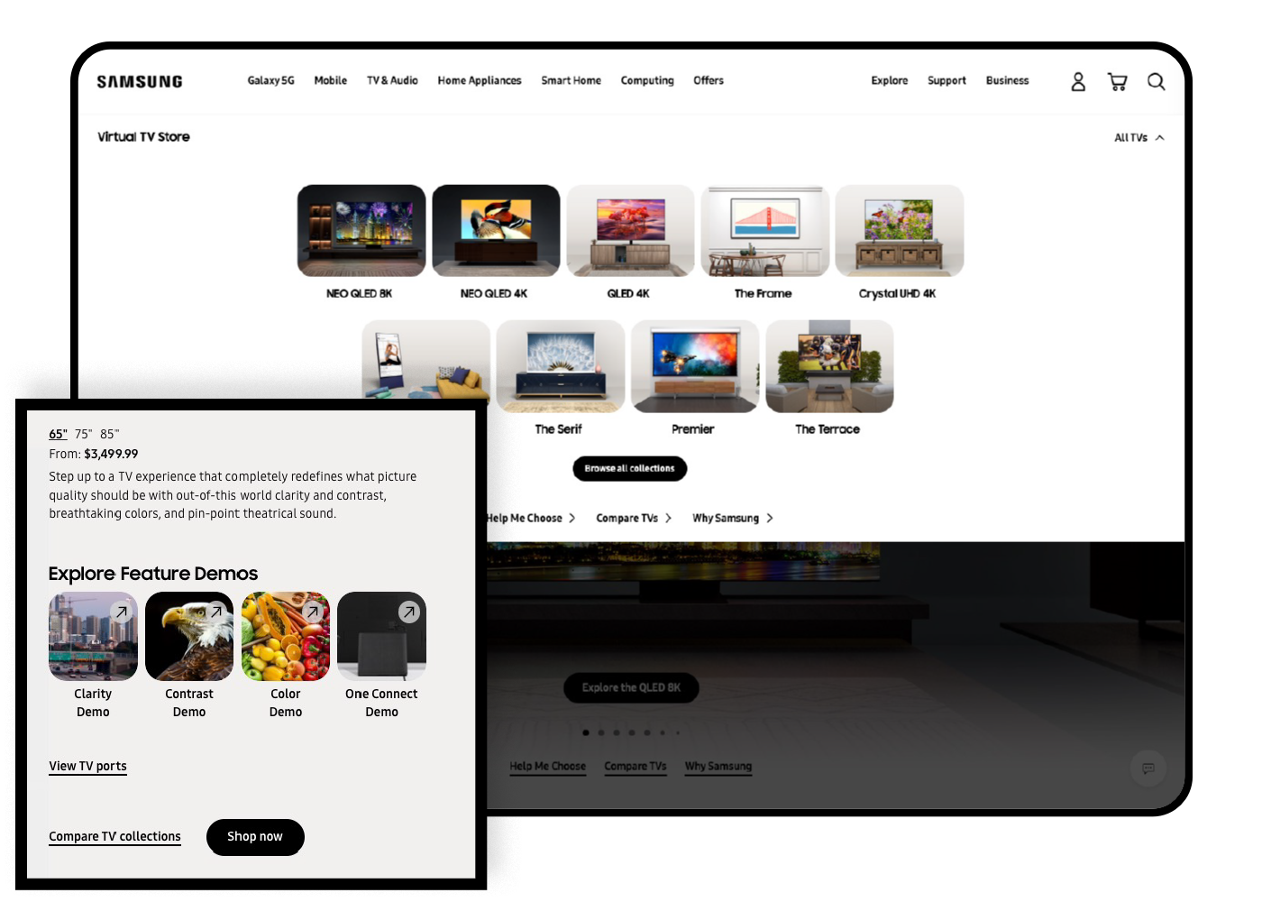
Virtual Store
B2B
What I led and managed.
I oversaw eleven members in three teams for Samsung NA (517MM visits) of strategic .COM design, CRM and UX research. My teams oversaw product launches, brand refresh and site optimization including Mobile, Home Appliance, Electronic, Gaming and Computing business units.
Managed Korea HQ goals with North America’s product KPIs with recommendations that localize and optimize the brand with UX, visual design, app, and CRM communications.
Managed Samsung NA eight product releases over a year from analytical, and segmentation strategy for 14% $54.6 MM lift. Organic ROI 22%. 390MM YoY revenue lift.
Additional Product Category Launches
My team measured, evaluated, and optimized the commerce design for Samsung.com N.A.
Shopping challenges to solve on two fronts
1 | Virtual stores in the pandemic
2 | Personalization at the homefront
The Situation.
COVID impacts proved challenging in 2021, but our team improved YoY online average sales over 11% to improve Samsung’s positioning and financial health.
In addition to eight successful product launches, including Bespoke appliance and Flip3, Fold3 mobile launch, we expanded our owned virtual retail and Best Buy online partnership experience. Phase 4 strategy launched November of 2021 on Samsung.com and Bestbuy.com in response to post-COVID shopping behaviors while supporting aggressive sales targets.
Part 1: Virtual Store 2.0
The insights
The usability research and analytics.
Previously, visits to the Compare page had a higher order rate (0.59%) versus the overall VS Benchmark (0.38%). The opportunity was to drive more visitors to this experience by enhancing content.
In Usability Testing we heard that the features and information included on the Compare page became useful to the participants to learn more beyond emphasis in picture quality. The Collection Menu was extremely useful for navigating between the different pages, though it was not obvious at first that this was a clickable menu for a majority of participants.
KPIs we evaluated
Improved Navigation Visibility, Additional UI element improvements
Elevate Screen size – Improve UI to showcase screen sizes better.
Compare improvements on notable features, direct comparison, and less technology jargon
Considerations
We drew upon Google’s research team that shared how consumer decisions can be messy to plan and chart. Human decsions are not always perfectly linear to model and diagram with many needs and emotions that influence their decisions.
Typically this is solved in storefronts where customer service facilitates this. We needed to solve this virtually with the pandemic hampering or disrupting customer purchasing.
Our Analysis
Drawing from Google’s Messy Middle Research
2.0 UX Enhancements
Optimize the Virtual Store to solve known pain points for a more intuitive user experience.
In our usability testing, the Collection Menu was extremely useful for navigating between the different Virtual Store pages, though it was not obvious at first that this was a clickable menu for a majority of participants. Previously on product listing pages, the sizes were among the most clicked elements on the page.
KPIs we improved
Improved Navigation Visibility
Elevated Screen size – Improve UI to showcase screen sizes better.
2.0 UX Enhancements
Optimize the engagement comparison shopping.
Previously, visits to the Compare page had a higher order rate (0.59%) versus the overall VS Benchmark (0.38%). The opportunity was to drive more visitors to this experience and continue to invest in enhancing the content.
In usability testing, we learned that the features and information included on the Compare page were useful to the participants, although there was a desire to learn more beyond the primary emphasis of picture quality.
KPIs we improved
Comparison improvements in:
Greater emphasis to notable features
More direct comparisons
Keep it Simple/ Make it Techy integration
Added a list in addition to the visual comparison plus other simple UI element improvements
2.0 UX Enhancements
Enrich the value of “Why Samsung” with brand strength
Previously, only 0.6% of Virtual Store visits clicked on “Why Samsung.” This was a lack of page interest with what we also heard from users, who mentioned that if they currently own Samsung products, this page would have little value to them.
Furthermore, users stated that the information on the “Why Samsung” page felt somewhat repetitive to what they had already learned throughout other pages in the Virtual Store.
KPIs we improved
Why Samsung: More immersive experience
2.0 Features & Customer Journeys
Content strategy with customer journey activation
We amplified the Virtual Store success by removing tech jargon with clear common language on relatable benefits and making an enjoyable, convenient journey to the product.
The prior experience was currently disconnected from the natural discoverability of TVs and related information on Samsung’s website.
Updating the content solved a critical gap in journey for learning about different collections to get them over the finish line toward purchasing a preferred model for their home.
KPIs we improved
CEJ within the experience including:
The collection to series journey
The addition of new TV Configurator
Site-wide journeys leading to experience
Improve connection between Virtual Store and other related information across the site
Responsive design improvements
Go to the site.
Visit the Experience
Part 2: Augmented New Product Experience
H. Choi, Design SVP Samsung Global
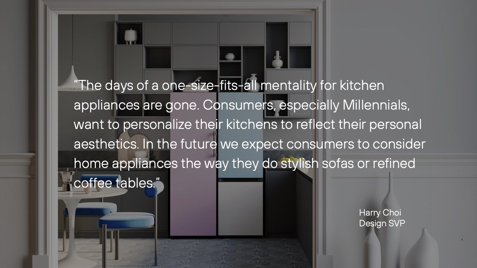
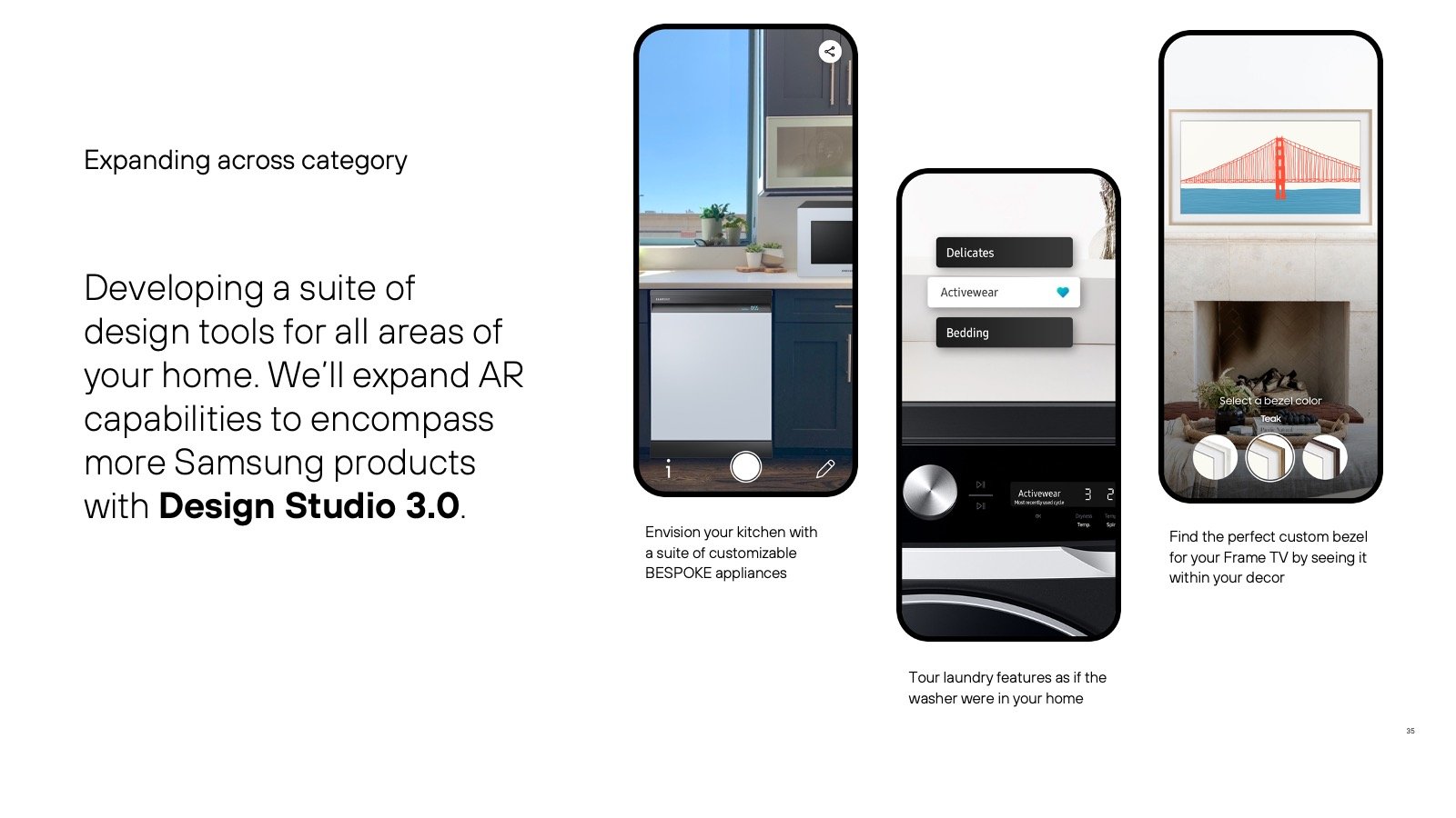
“The one-size-fits-all mentality for kitchen appliances is gone.
Consumers, especially Millennials, want to personalize their kitchens to reflect their personal aesthetics. In the future we expect consumers to consider home appliances the way they do stylish sofas or refined coffee tables.”

My team measured, evaluated, and optimized the commerce design for Samsung.com N.A.
The Metric Insights









Approach: How it comes to life
The Delivery.
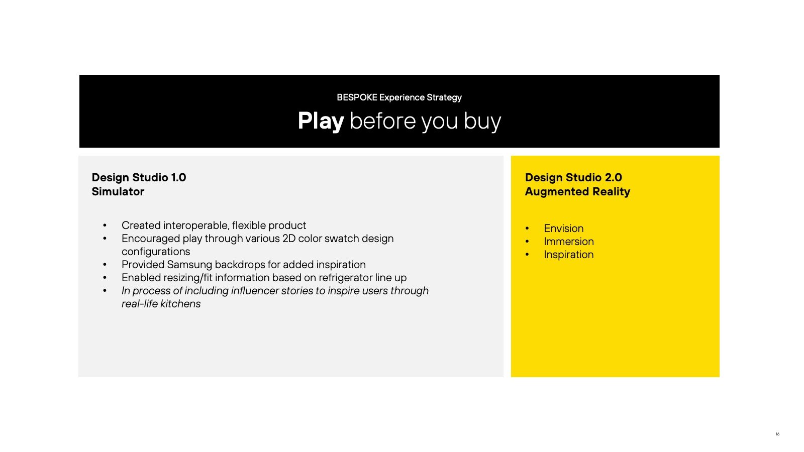
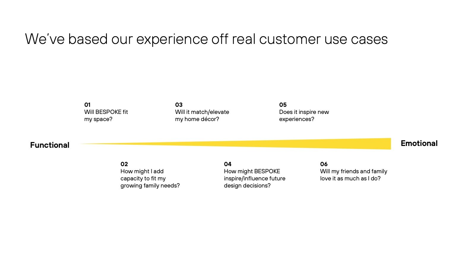
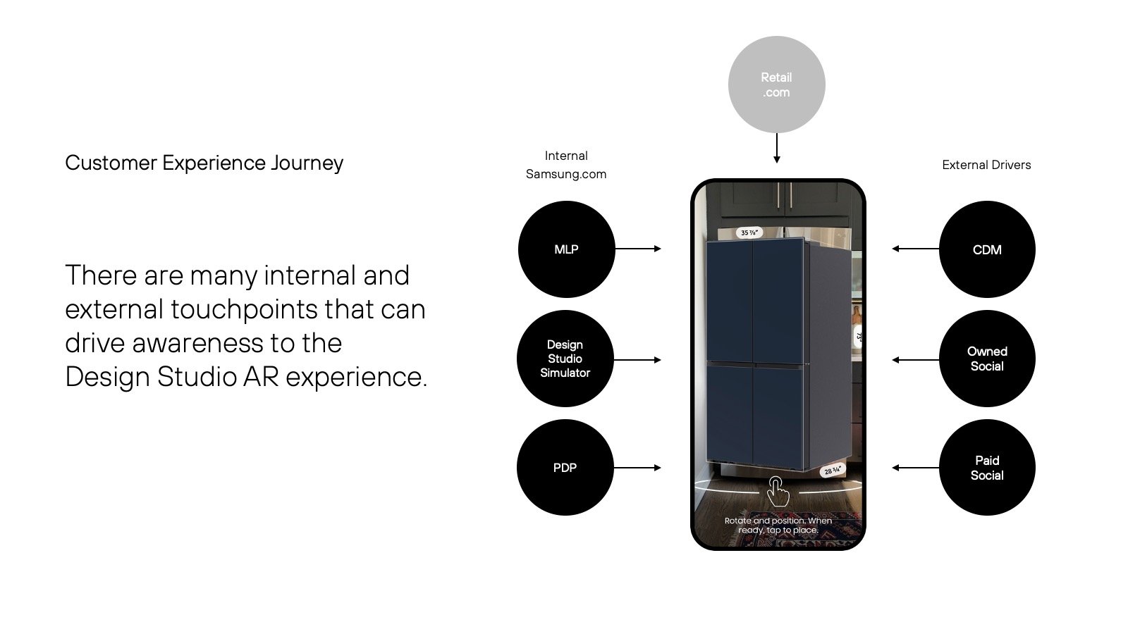
We delivered the experience with a site-wide design audit from user research of design patterns and architecture flows (user journeys) for approved designs for interaction, visual design and front-end development specs. This allowed the client to understand and make consistent decisions from the relationships in patterns. The interaction designs were finalized for the customer segments.
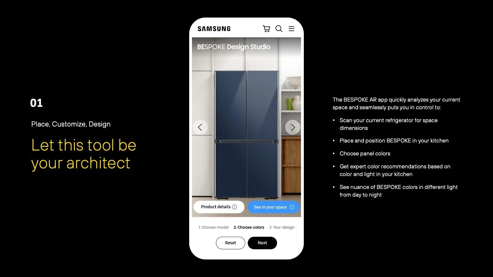
Engagement within the home: tool as your architect
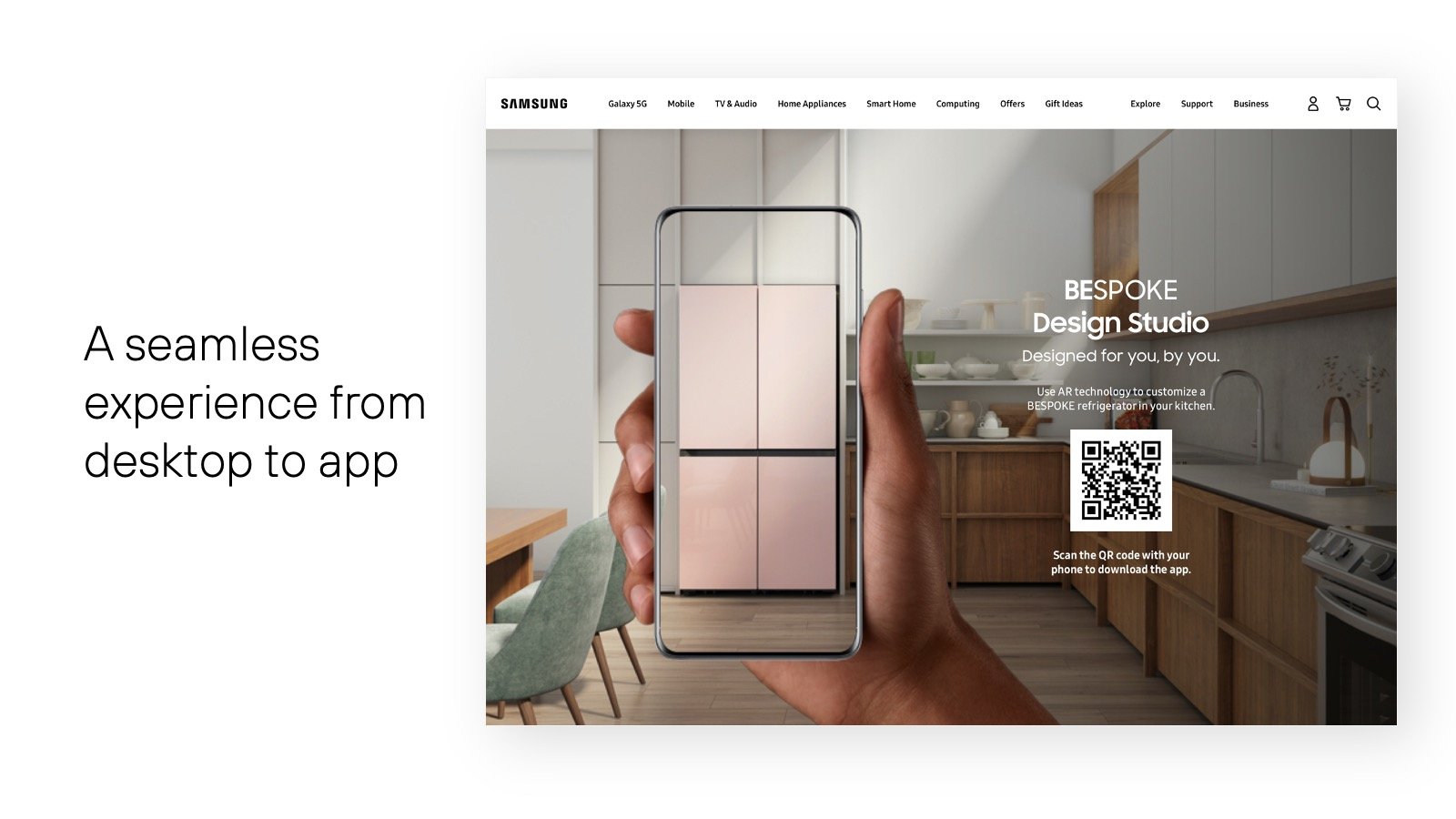
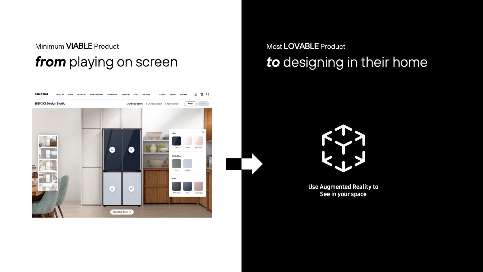
The BESPOKE AR app quickly analyzes your current space and seamlessly puts you in control to:
Scan your current refrigerator for space dimensions
Place and position BESPOKE in your kitchen
Choose panel colors
Get expert color recommendations based on color and light in your kitchen
See nuance of BESPOKE colors in different light from day to night
Construct a space you envision
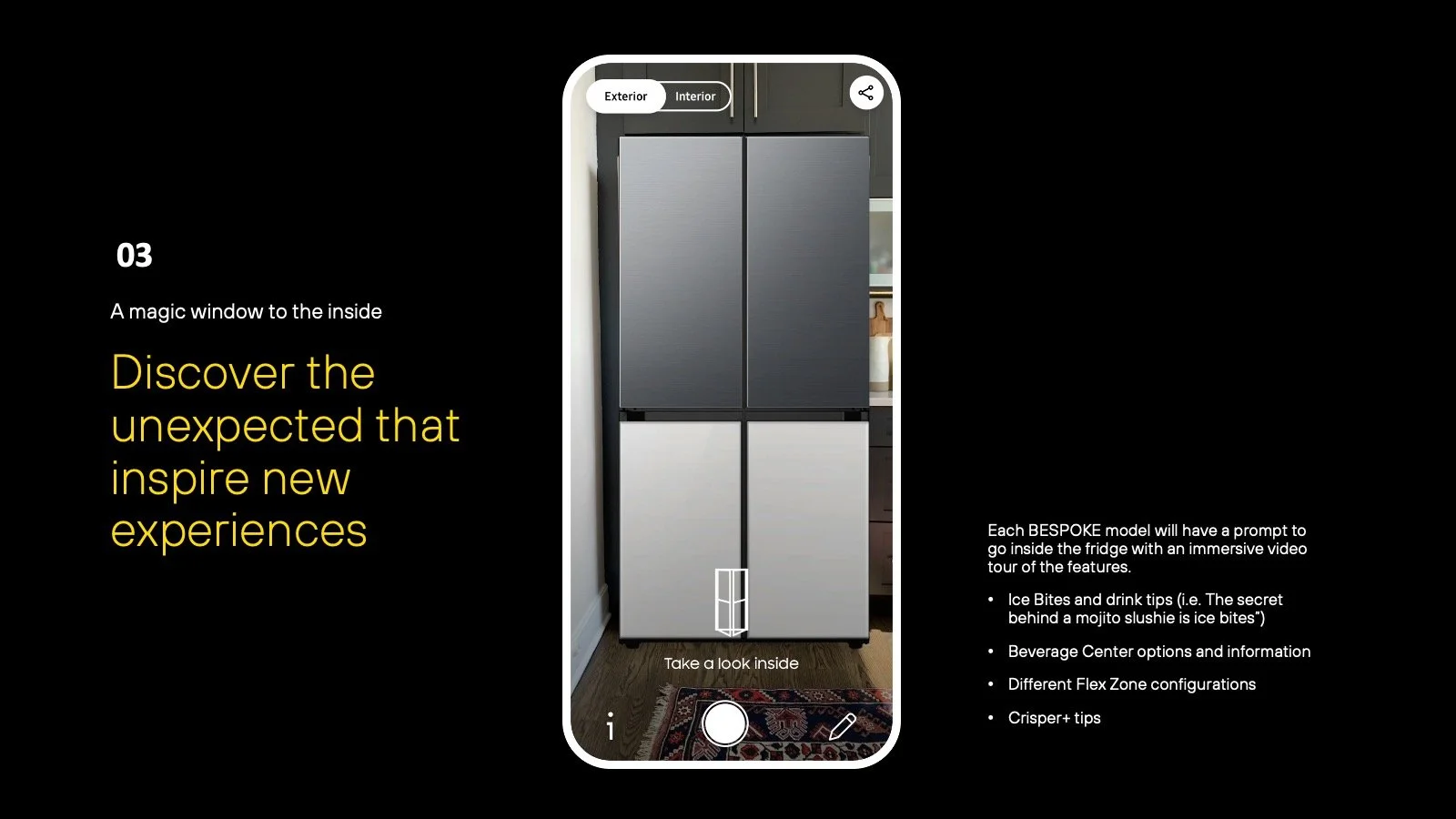
Each BESPOKE model will have a prompt to go inside the fridge with an immersive video tour of the features.
Choose and combine different models and replace your current refrigerator
Choose anything from a cabinet to wall colors and textures to create a canvas
Discover the unexpected
Each BESPOKE model will have a prompt to go inside the fridge with an immersive video tour of the features.
Ice Bites and drink tips
Beverage Center options and information
Different Flex Zone configurations
Crisper+ tips
Seamlessly purchase and share the experience
BESPOKE models have immersive features with accessible information that can be shared
The BESPOKE AR app allows for one-tap access to product info and seamless buy-now purchase. Allows multiple designs to be saved and then GIF shared.
Social Media recording allows shoppers to share their favorite designs.
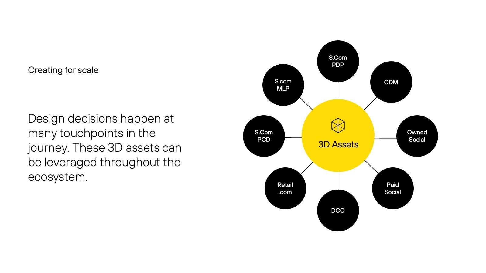
Path to Purchase with Site-wide Scale
The BESPOKE AR app allows for one-tap access to find price and product info, as well as a seamless path to purchase with the Buy Now button.
The app's save functionality will allow multiple designs to be saved and then shared in one imaginative GIF to give more context and comparison.
And a video recording gives shoppers the ability to share their favorite designs to their social media feeds.
This was foundational to providing scalable architectures while feeding greater omnichannel data insights on customer behaviors and interests.
Online orders increased 9% six months after launch.
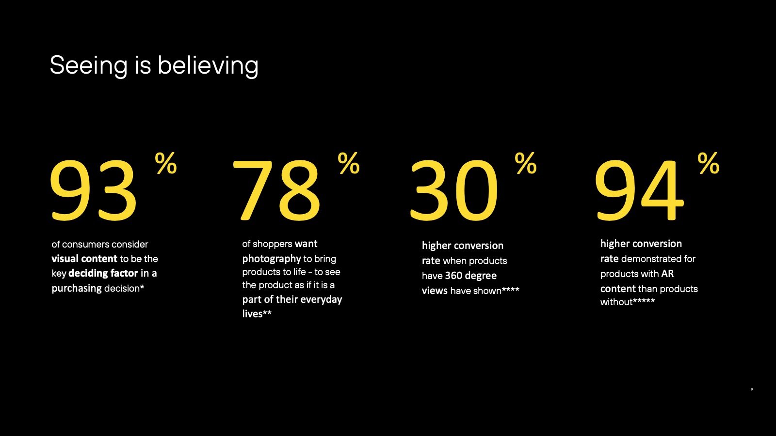
The KPI performance results:
-
93%
of consumers consider visual content to be the key deciding factor in a purchasing decision
-
78%
of shoppers want photos to bring products to life – view as if it is a part of their everyday lives
-
30%
higher conversion rate when products have 360-degree views have shown
-
94%
higher conversion rate demonstrated for products with AR content than products without
Go to the app.
Visit the Experience
Go to the site.
Visit the Experience
“We had a successful product launch last week and wanted to thank our agency partners for their dedication to making this a success.”
— S.Com Marketing Executive
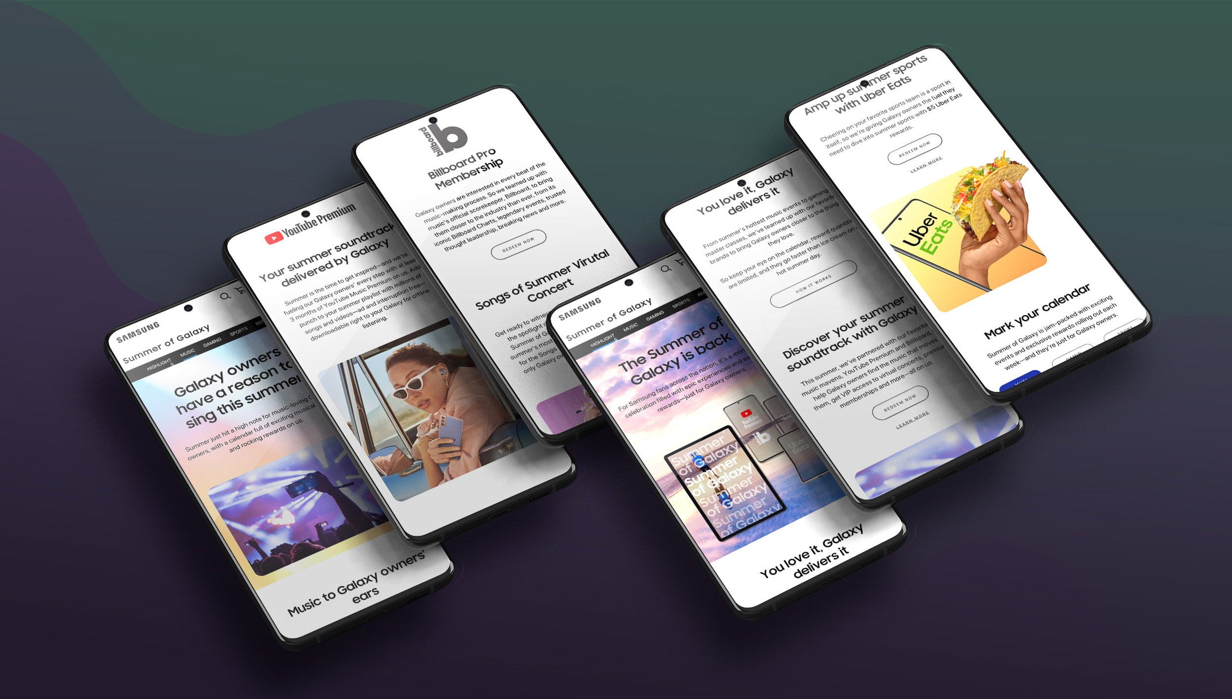
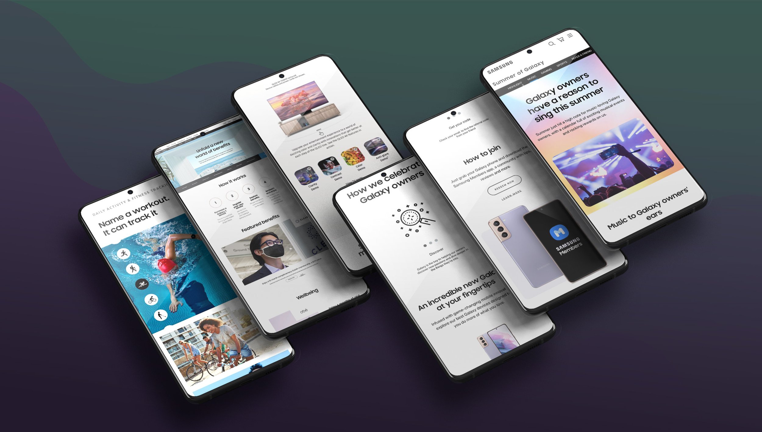
Celebrating their passions: Summer of Samsung (at Request)
