Booking & Loyalty UX
Marriott asked to deliver their next-gen agent experience just prior to the SPG acquisition. This was known as the Engage Framework.
The Challenge.
Deliver the agent experience “Engage Framework” (code name) that would minimize barriers between the customer online experience and agent servicing with business justifications on investments. We must include reservations, customer care and loyalty into a single experience for agents that balances speed and discovery to maximize customer spend.
Q: Is 40% of calls that don’t book, a missed opportunity?
Modern travelers have more tools at their disposal than ever before. The question remains - do we build a greater portfolio information tool for agents, or more direct one?
The Objectives.
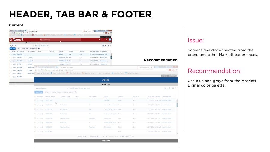
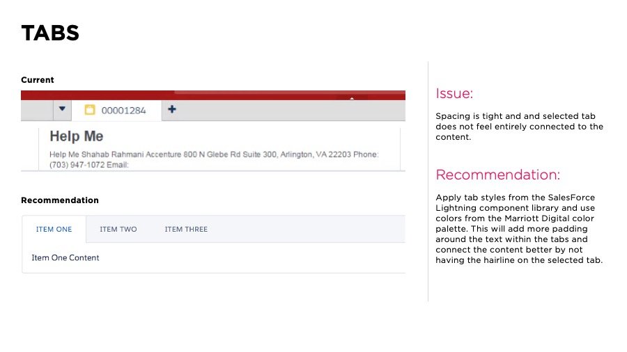
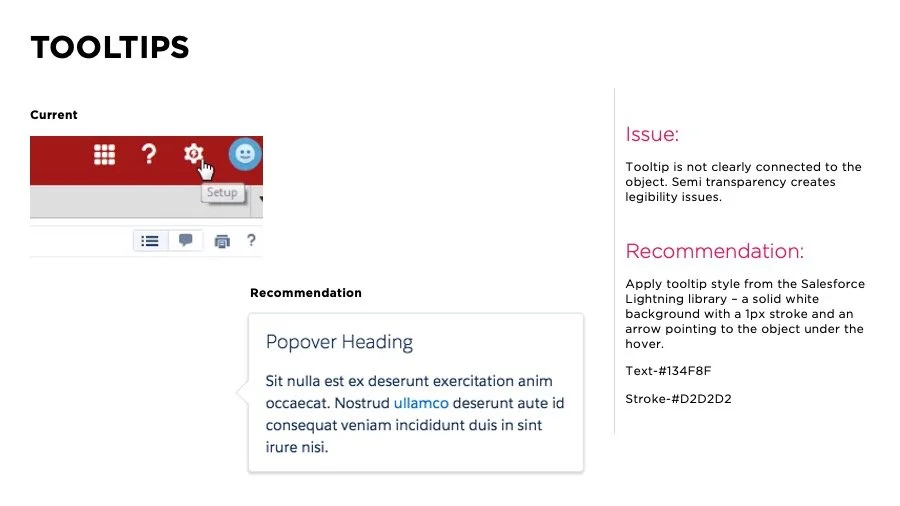
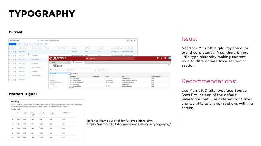
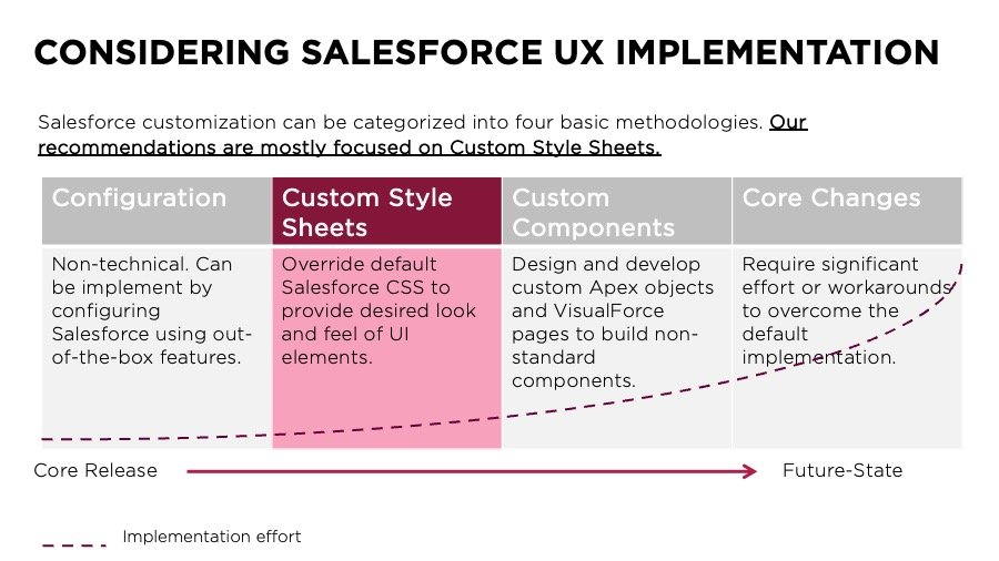
Establish UX + Visual Design recommendations (utilizing existing Marriott digital presence and Lightning principles) for the Engage platform to ensure better usability and consistency across out of box and custom experiences.
Provide Salesforce and Engage platform developers with basic design principles and CSS recommendations to help make their solutions more usable and reduce training for the end users.
Identify opportunities to use Lightning to address out of the box usability issues/improvement opportunities.
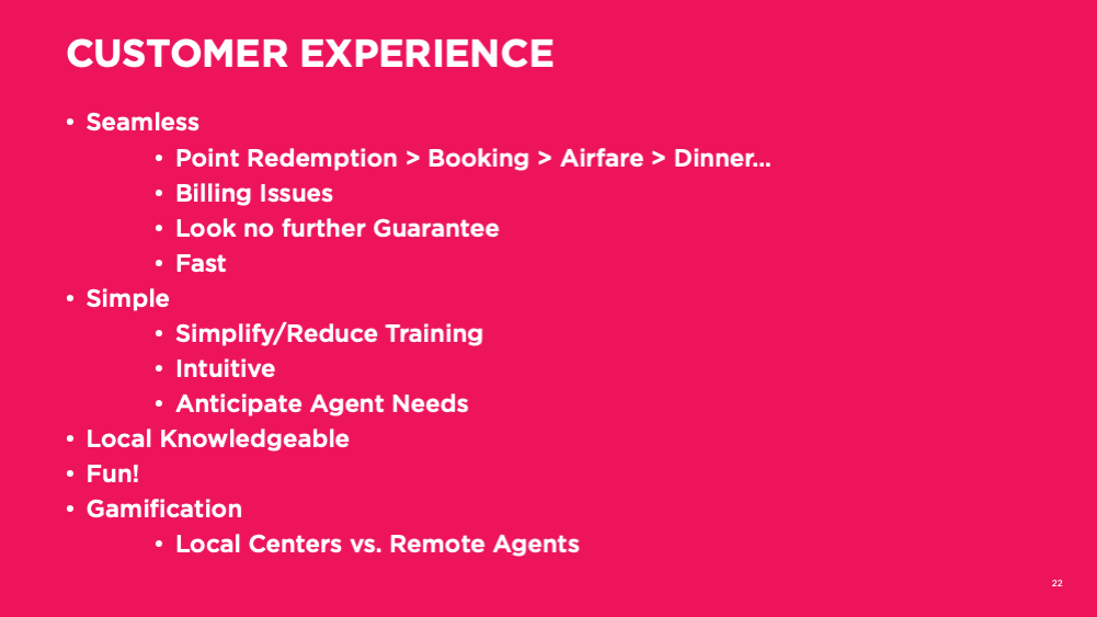
Leverage universal traits/ design basics to improve the experience for the 8-hour shift Agents will spend within the tool.
Provide recommendations and best-practices for improved accessibility.
Consideration: Customizations to out of box made prior to Lightning release being “throwaway” vs. the time that might be required to realize Lightning.
-
5
Prototypes created including test and learn with agent feedback
-
31
Agents Interviewed in 2 call centers; Omaha and San Antonio
-
39
Total Team Hours of Contextual Research
-
148
Callers/Cases Shadowed across Reservations, Rewards and Customer Care

The Approach.
Stakeholder discovery workshops
On-Site research (agent call centers)
Stakeholder Share-out & Workshop
Future-State Experience Strategy Modeling & Task Flows
CRM/SalesForce UX Guidelines for Front-End Dev
Rapid Prototyping
Design Ideation
Content Strategy
User testing/Validation
Annotated wireframes
Visual Design Annotated Framework
Architecture

We looked at various travel experiences and developed recommendations on leading indicators to measure.
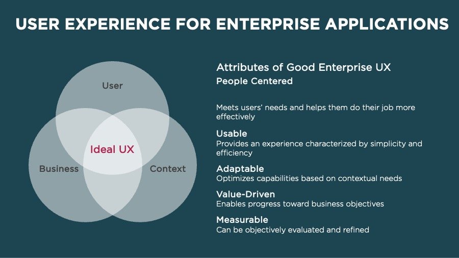
Salesforce UX guiding principles.
Actions and information should support user needs and meet user expectations.
Ex: Use different and larger typeface for headings; consider use of color
Primary activities should be predictable and calls to action should guide user interaction.
Ex: CTA’s in the same location on each page and with similar styling
Completing tasks should require a minimum number of steps.
Ex: Hide unnecessary fields
Interaction patterns should be action-oriented.
Ex: Style information hierarchy with typeface, size and coloring
Develop consistent navigation schemes which provide adequate feedback.
Ex: Alphabetize lists in dropdowns – users will expect this organization
Forms should provide users with feedback and support to minimize data input errors.
Ex: In-line error messaging
Large data sets should be easily navigable and support the completion of user tasks.
Ex: Use of padding around data sets to call attention to important pieces of data and content layout
-
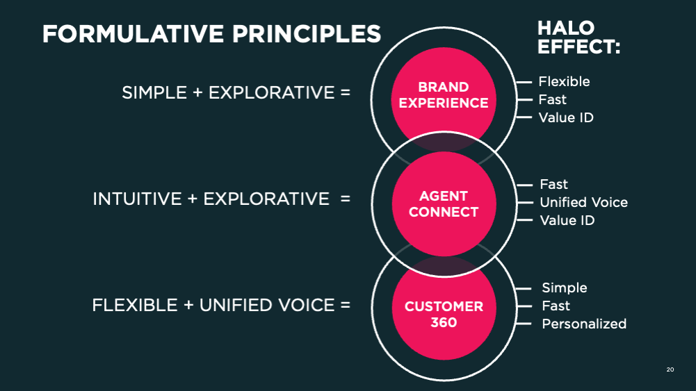
KEY PRINCIPLES FROM RESEARCH
Explorative - enabling the agent to help visualize, solution and describe value in each experience over the phone
Personalized - providing a greater, tailored stay based on insightful conversation that adds richness to the experience and fulfilling expectations
Unified Voice - is removing various interpretations by both conveying best practice resolutions to the customer as well as communicating fluid exchange between agents on call transfers
Value ID - identifying, pairing and validating with the customer within the spectrum of folio expectations to meet perceived value
-
KEY PRINCIPLES FROM MARRIOTT
Fast - finding the most time efficient approach to achieving customers goals
Flexible - being able to sense and quickly respond to a customer’s need with adaptive results that respond upon their goals
Intuitive - facilitating suggestive processes the resolve solutions instead of further complicating them
Simple - when you can no longer remove anything necessary
What the brand research shows.
Understanding of brands
Some newer agents are missing full understanding of the brands and what they offer in comparison.
Senior business travelers require higher class stays and need agent’s knowledge of offerings, value.
Agent Hotel Concierge Services
Agent occasionally doesn’t have local knowledge and not sure if hotel will capture customer’s requests through the notes. Agent has to transfer call to hotel’s concierge
Agent Understanding of local attractions, amenities
Agents don’t have access to hotel’s floor plan or what transportation options are available near by (Train, public transportation, Uber not available in some cities)
Agent understanding of hotel physical details
Agents don’t understand the stay experience of each hotel to match customers to the right hotel. This can be accomplished with better hotel profile.
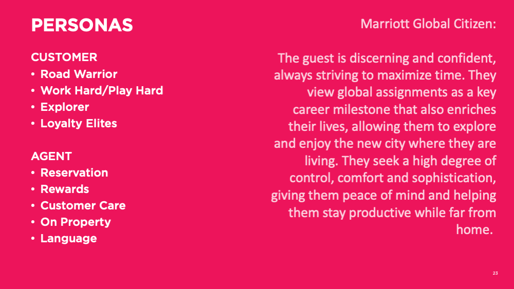
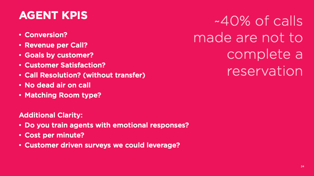
We evaluated the call center agent lifecycle stages with a customer
We then looked at the reservations segments within the journey to measure
Trend: Call Volume
The salesforce pattern libraries
"Josh kept a positive attitude throughout the project, even as obstacles started to appear. The highest praise I can give him is regarding his attitude... Josh tackled the massive load of requirements, and worked to develop a deep understanding of the existing platform in order to map the new requirements into the functional approach of the current system. Without this reconciliation, the team would have been unable to pivot so effectively to the new approach dictated by the client."
— E.D. Fjord Director for Marriott Account


